




Carlos Pharmaceuticals runs an approved manufacturing plant in Calabar. It produces solid, liquid, semi-solid and sterile dosage forms: antimalarials and analgesics, children’s syrups, capsules and topical creams. When the company asked us to design its cartons and labels, the brief was simple to state and hard to do. Give a wide product range a consistent, trustworthy shelf presence, and produce product visuals the sales team can use before stock reaches pharmacies.
Packaging for medicine is not like packaging for snacks or cosmetics. Here is what the project taught us.
Two audiences read every pack
A carton on a pharmacy shelf is read by a pharmacist reaching quickly for the right product, by a patient or parent checking what they are buying, and, before any of that, by a regulatory team checking every word. The design has to serve all three without letting one get in the way of another.
It also changes how we review work. A packaging review with a pharmaceutical client is never only about taste. Every layout is checked for space: will the full product name, the strength, the dosage form and the batch information still fit when the regulatory team adds the final text? We would rather solve that at the start than squeeze type at the end.
That shaped our first rule. The regulatory content on each pack, the names, strengths, dosage information and statutory text, is supplied and approved by the client’s regulatory team. We design the system that holds it. We do not write it, and we do not move it for the sake of a layout. Regulatory sign-off stays where it belongs.

One system, many products
The risk with a large range is that every product starts to look like a different company. Each launch gets its own idea, and after a few years the shelf is noisy. The opposite risk is just as real: if everything looks identical, a pharmacist picks up the wrong box.
Our answer was to give each therapeutic line its own colour and graphic motif inside one shared system. The Artemether/Lumefantrine antimalarial is red. The children’s cough syrup has its own playful treatment. NeuroPlus Gold carries a gold wave, Benzyl Benzoate lotion purple and gold swirls, Diclofenac an orange texture. The structure, the brand position and the order of information stay the same, so the shelf still reads as Carlos.
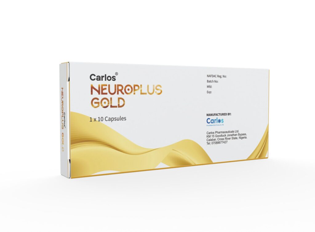
Colour by product line is not decoration. It is a navigation system for the person standing at the counter.
Colour that survives the real world
Pharmacies are bright, crowded and fast. Cartons are stacked, turned sideways and seen from a distance. We check colour and contrast on a stacked range, not on a single carton floating on a white page. If two lines can be confused at arm’s length, one of them changes.

Renders before stock
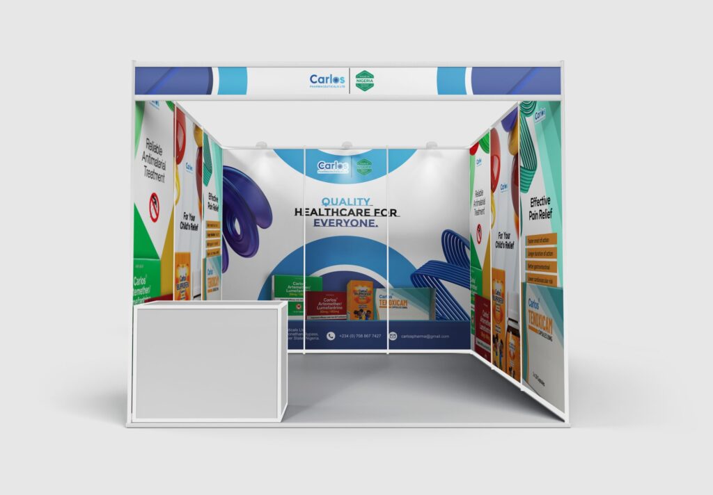
Sales teams often need to sell a product before the first print run arrives. Waiting for photography of finished packs means months without visuals. So we modelled every carton in 3D. The renders went into brochures, onto the exhibition stand and onto social media, and we animated some of them as short loops, like the Piroxicam capsules carton turning in space.
Because the renders come from the same artwork files as the print, they stay accurate. When a carton changes, the render changes with it.

The pack and the campaign should agree
Packaging does not live alone. For the same client we designed an exhibition booth, product brochures, A5 flyers and an animated product film under one line: “Where science meets care”. Each product line keeps the colour it has on the shelf, so a medical professional who meets Carlos at a conference recognises the same products later in a pharmacy.
We also ran design training for the Carlos team, so the people who produce everyday materials in-house can keep them consistent with the system. The company’s Technical Director described it this way.
“Having to learn from Ahlfigh opened my eyes to some things I never knew Pixellab could achieve. He taught me the basics and now I can manipulate almost anything with the app.”
Pastor Ezekiel Ibidapo, Technical Director, Carlos Pharmaceuticals
A short checklist
- Agree who owns every word on the pack before design starts. In pharma, that is the regulatory team.
- Design a system first, then the products. Decide what stays fixed and what changes per line.
- Give each therapeutic line a colour and motif a pharmacist can recognise at a glance.
- Check the range stacked, at arm’s length, under shop lighting.
- Build 3D renders from the print artwork so sales can start early.
- Carry the same product colours into brochures, stands and film.
None of this is glamorous. It is the work that makes a shelf look like one company and makes the right box easy to find.
